VERVE
- Packaging design
ABOUT PROJECT
> PACKAGING DESIGN
[ 2024 ]
Dynamic, trend-setting packaging for Verve’s new natural energy drink.
[SERVICES]
Concept Development
Typography
[CREDITS]
Agency: Niceto Design
Art Director & Designer: Nataliia Bazaka
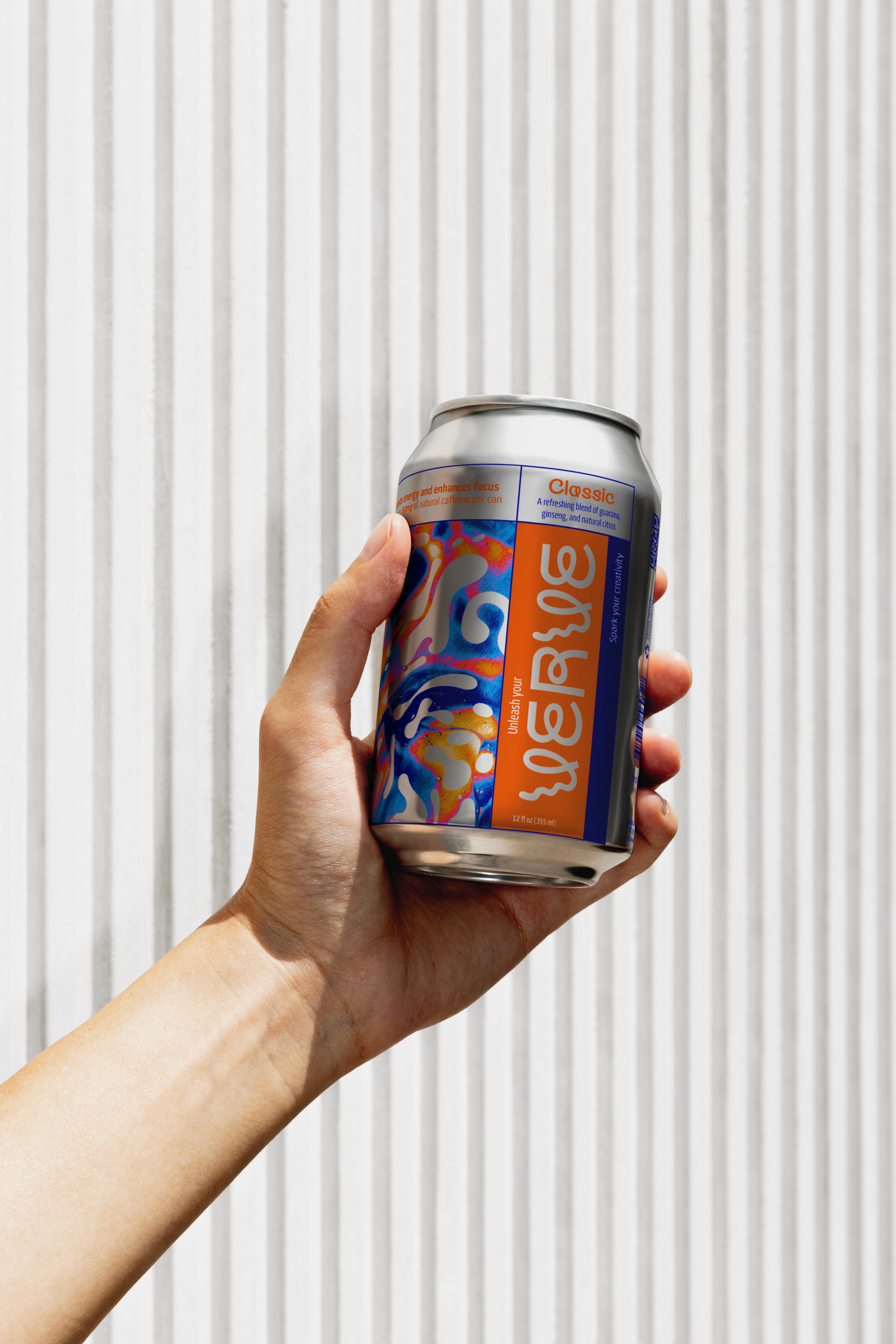
Verve, a new player in the soda market, needed a packaging design for its new natural energy drink aimed at creative, health-conscious professionals. They wanted something trendy and eye-catching that would resonate with their audience while embodying the concept of sustained, natural energy.
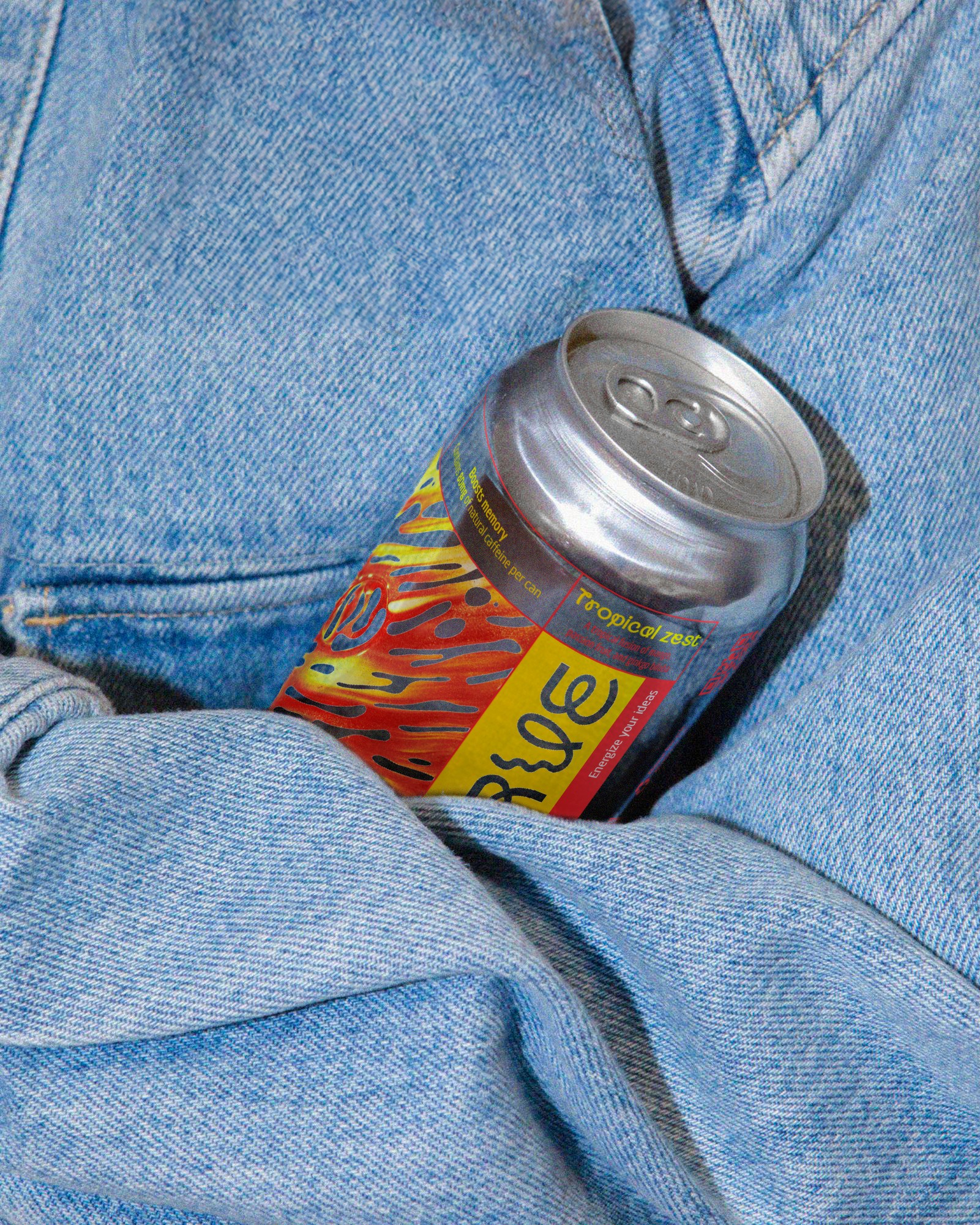
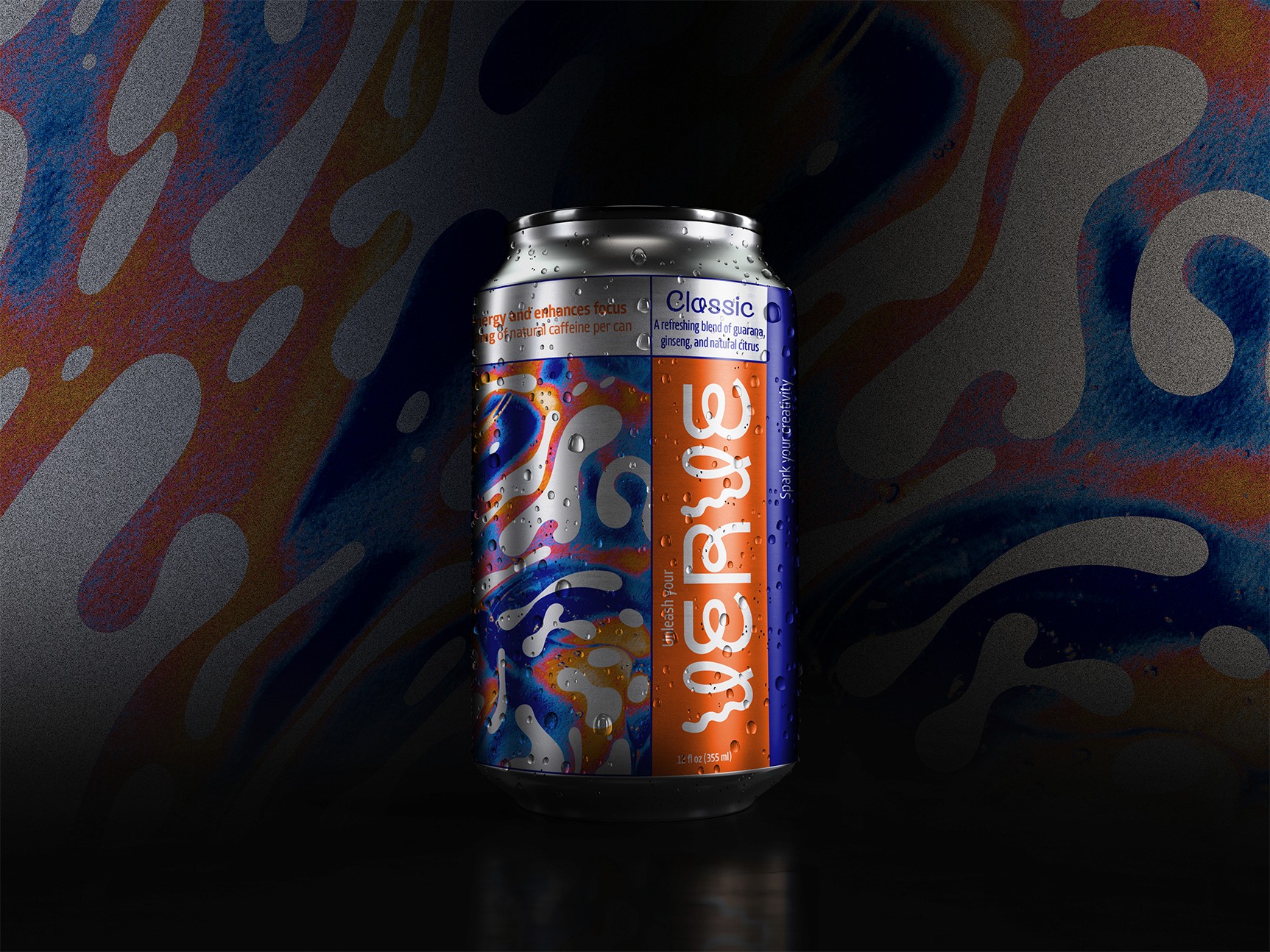
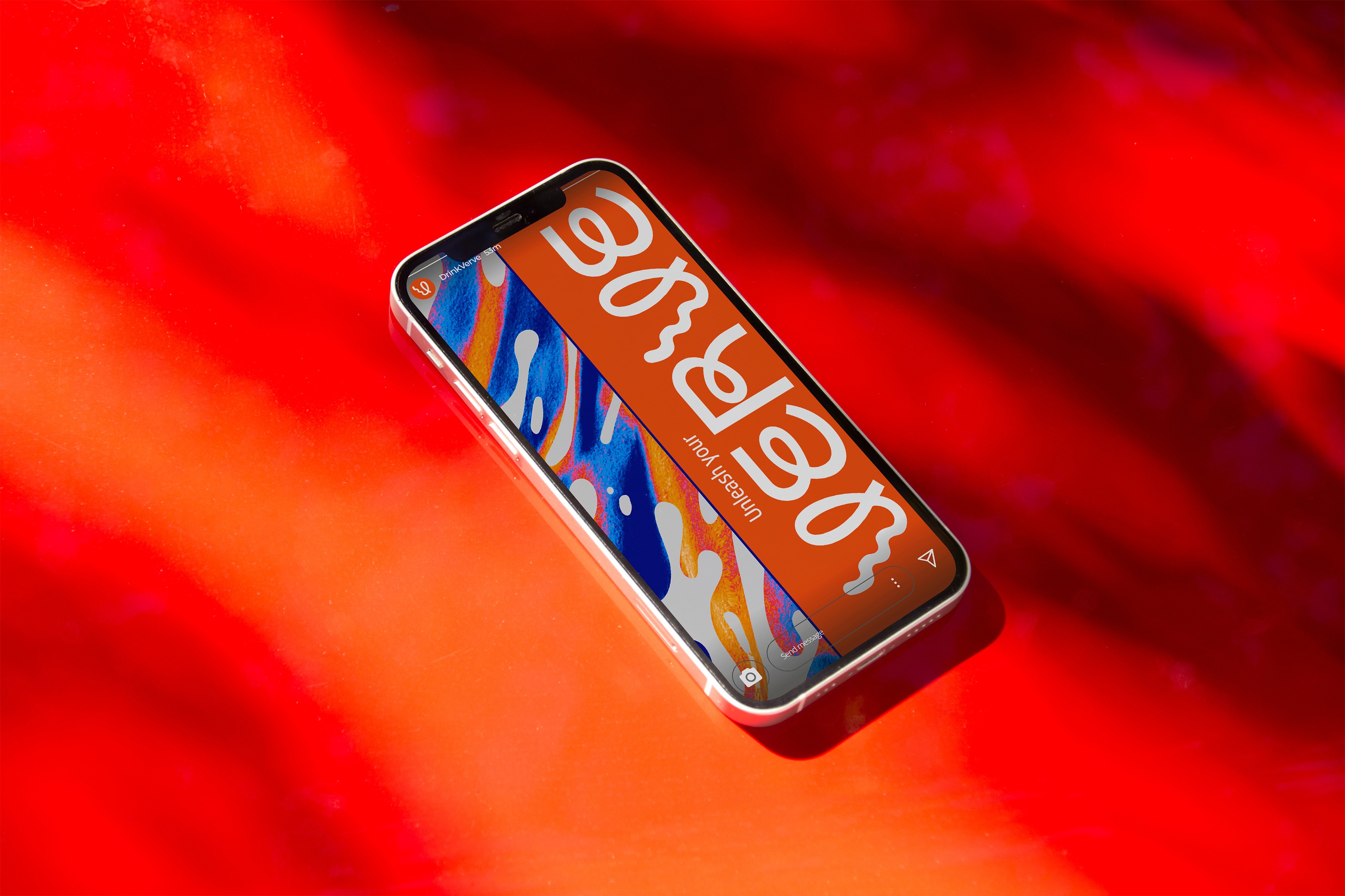
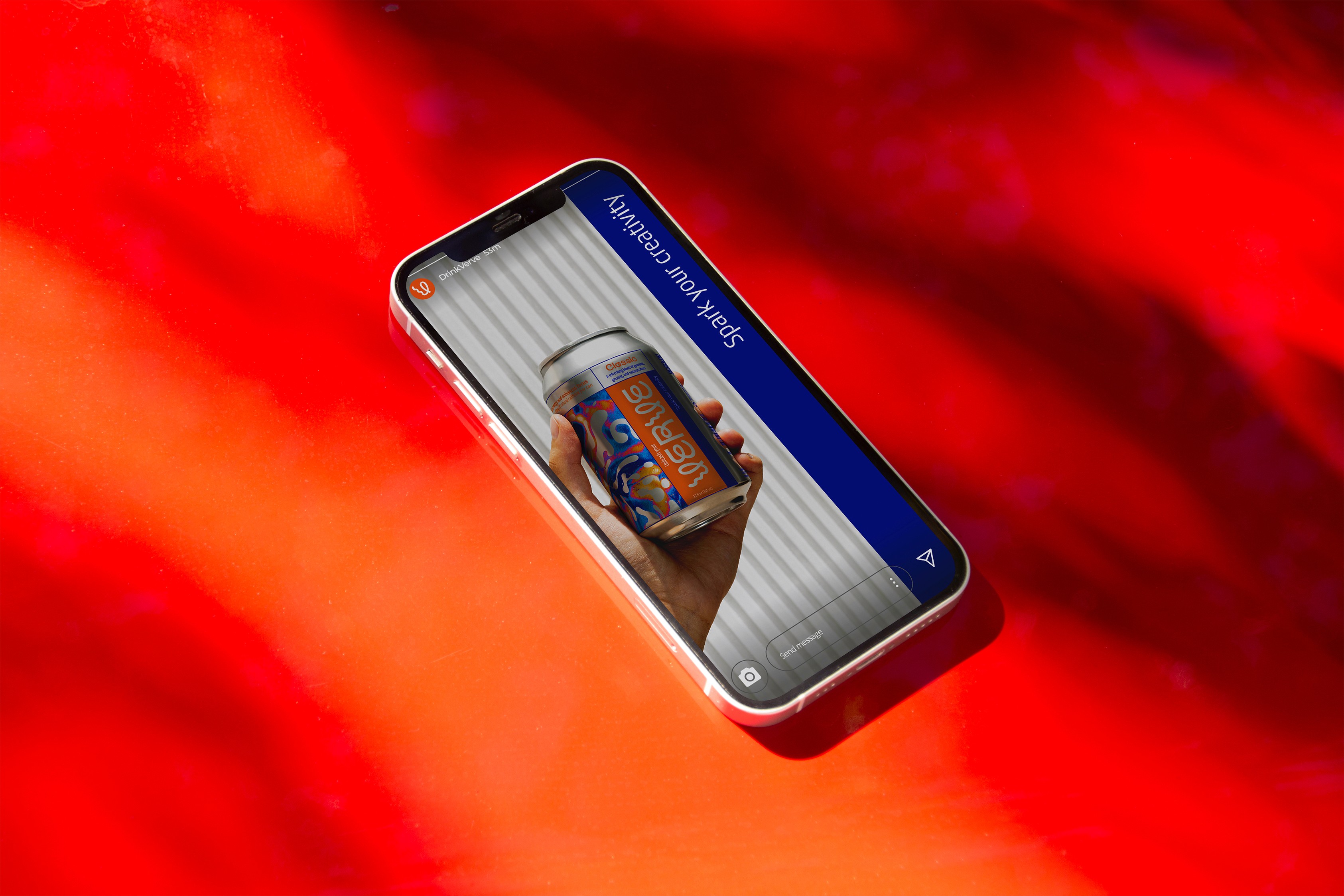
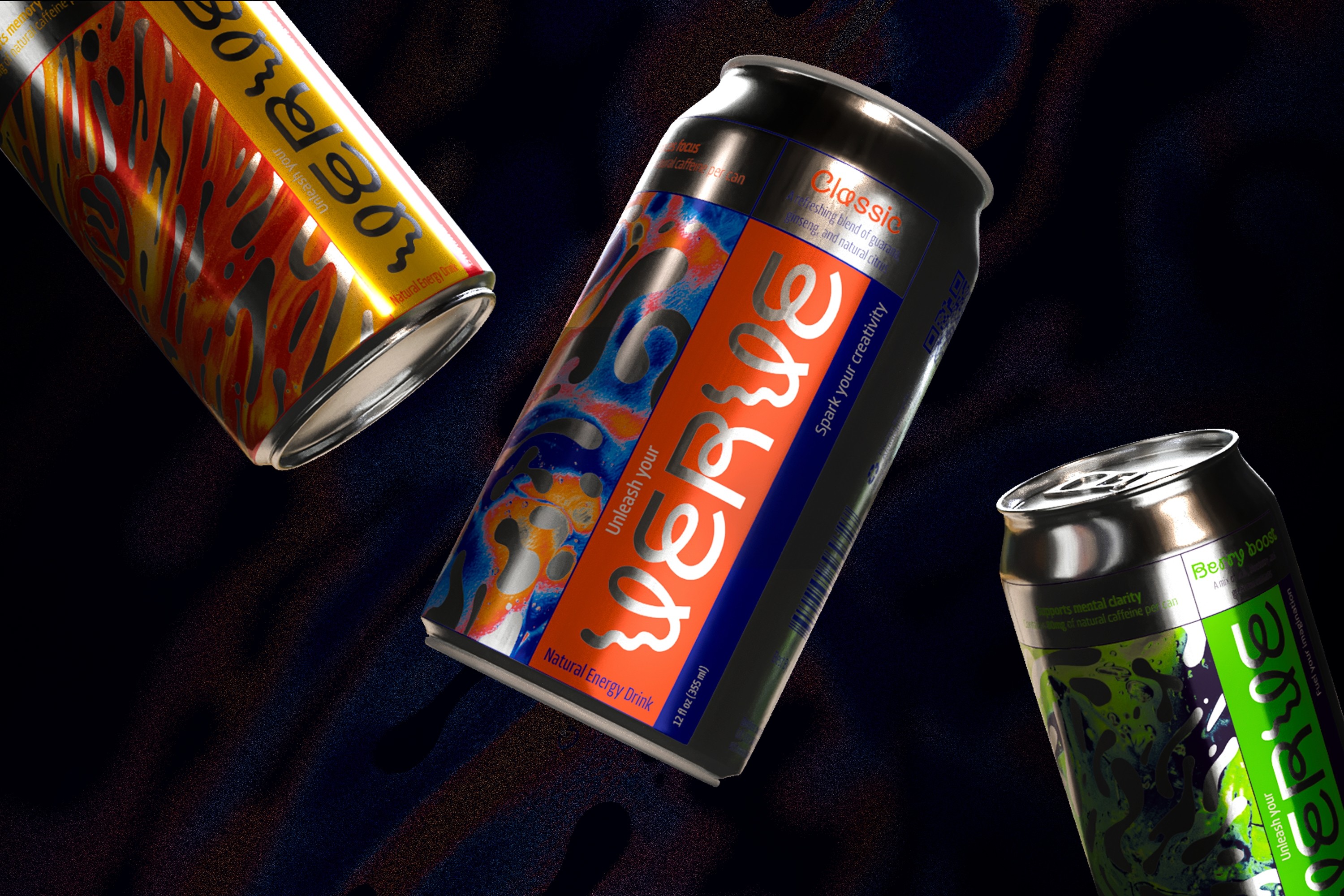
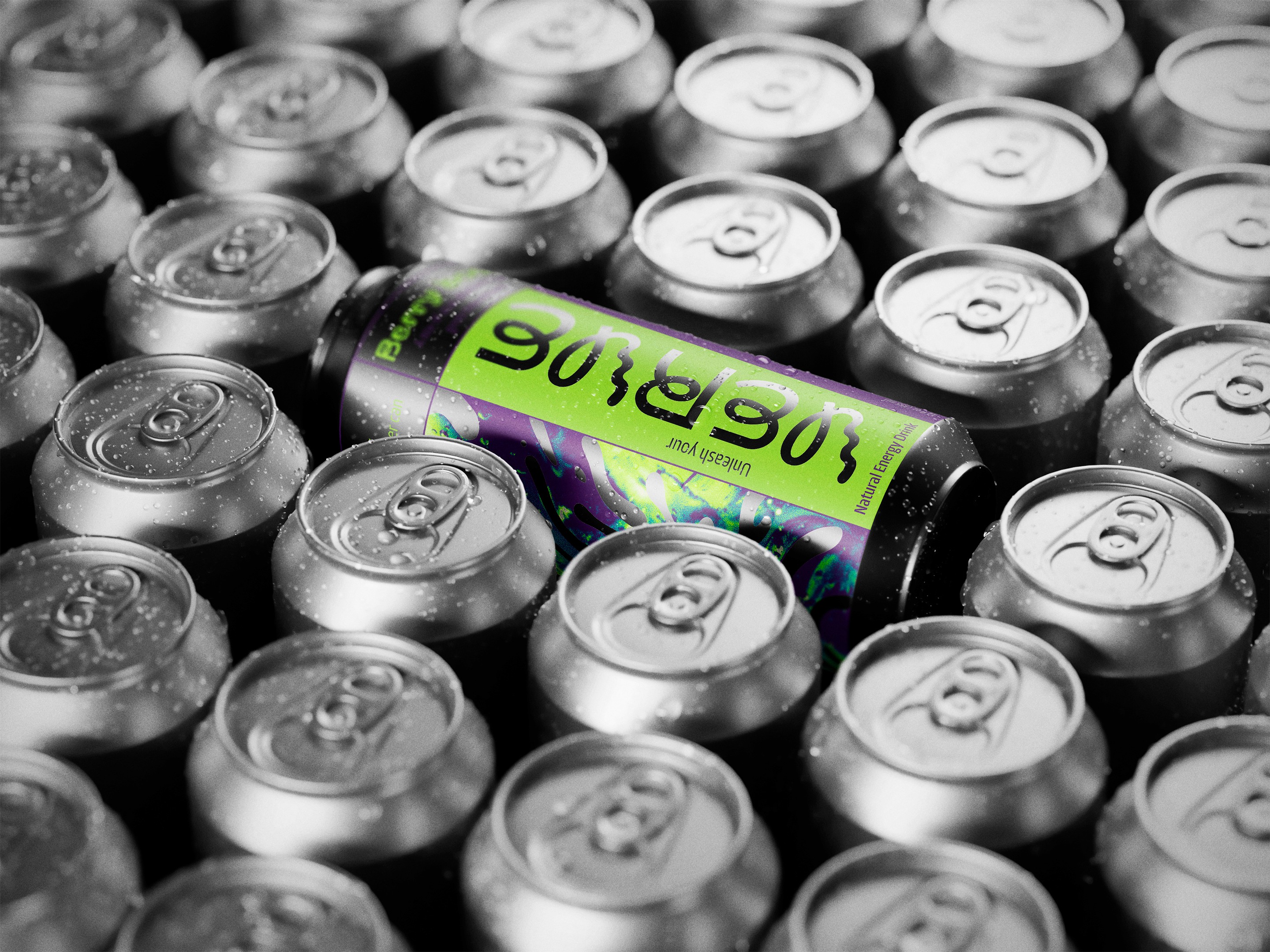
The design centred around the fluidity of a liquid, a metaphor for energy constantly in motion. Cutouts on the packaging revealed the aluminium can underneath, giving the design a modern, layered look. Bright, bold colours and dynamic, organic shapes were used to represent the flow of energy. The packaging was also designed with flexibility in mind, allowing future collaborations with artists to easily replace the artwork without altering the core design.
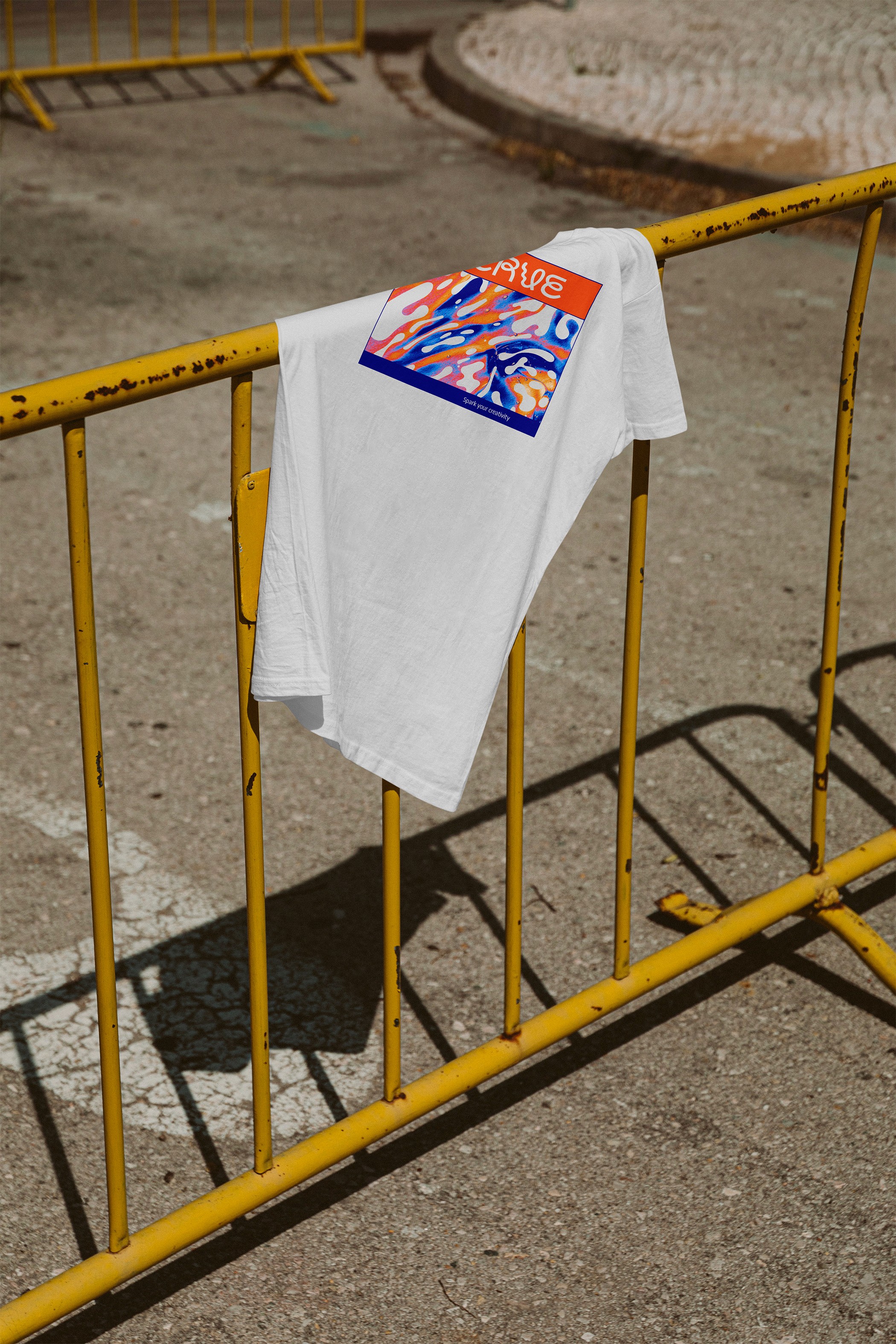
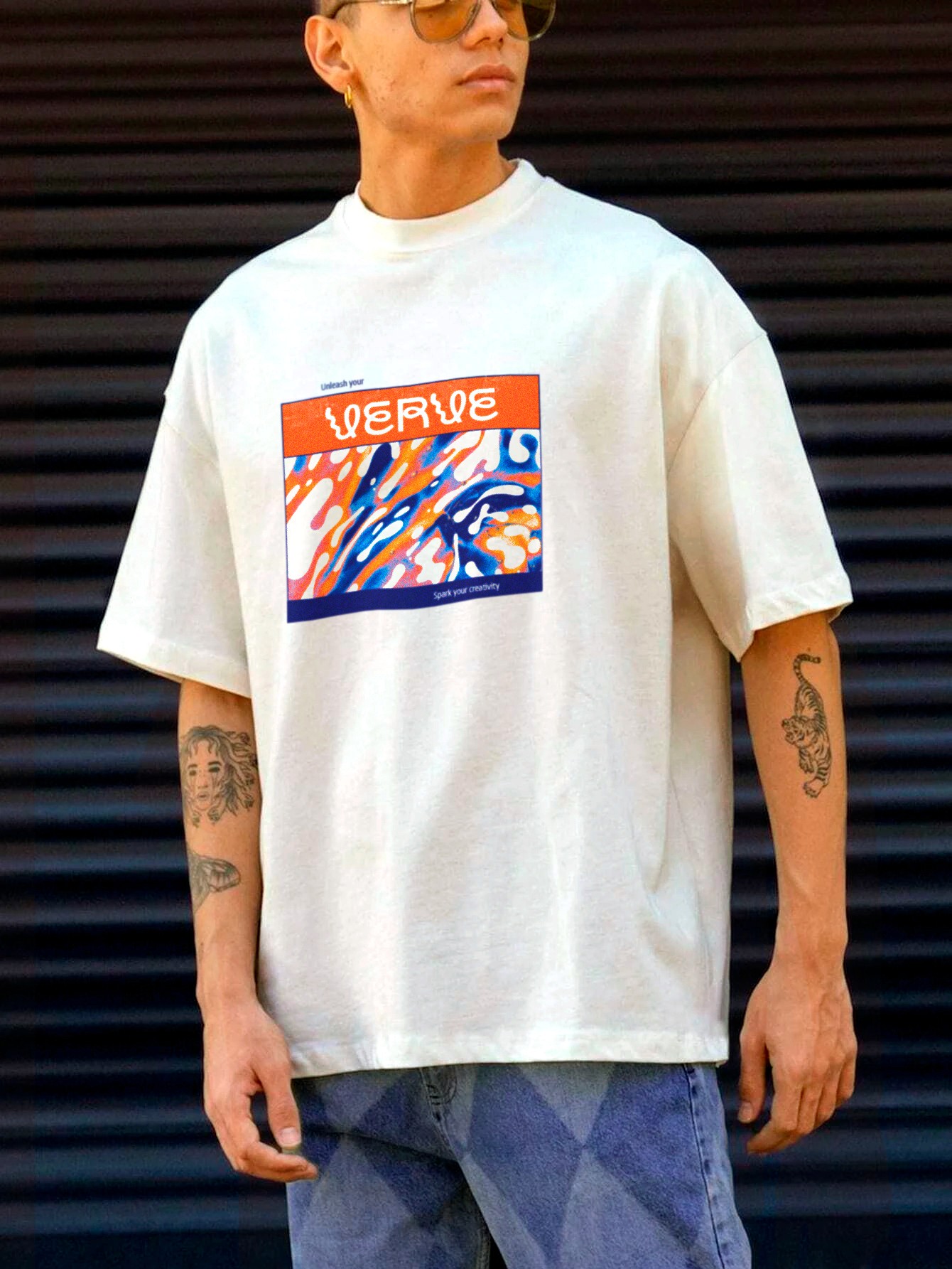
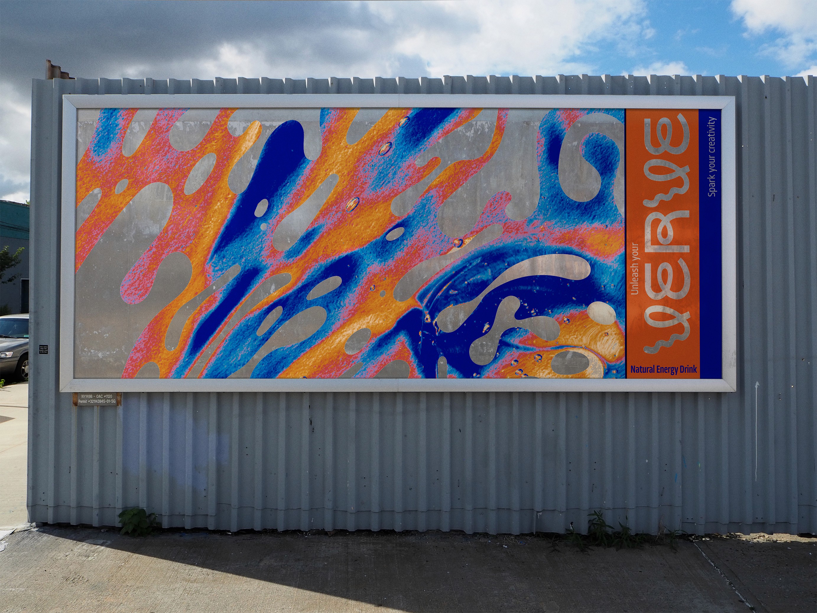
The final outcome included packaging for three different flavours, as well as complementary assets like social media visuals, t-shirt designs, and a brand board that showcased how the brand could expand. Although this was a trial project and won’t be produced, it set a vibrant, energetic tone for the brand’s future.
We are always open for new and exciting opportunities and we are never not on the lookout for talents and bright minds.
[ BRANDS WE DESIGNED FOR ]
SOLVING PROBLEMS
WITH DESIGN
Driven by our love for design, we bring a touch of the extraordinary to every project.
© 2023—2024 NICETODESIGN studio
SOLVING PROBLEMS
WITH DESIGN
Driven by our love for design, we bring a touch of the extraordinary to every project.
© 2023—2024 NICETODESIGN studio
VERVE
- Packaging design

ABOUT PROJECT
> PACKAGING DESIGN
[ 2024 ]
Dynamic, trend-setting packaging for Verve’s new natural energy drink.
[SERVICES]
Concept Development
Typography
[CREDITS]
Agency: Niceto Design
Art Director & Designer: Nataliia Bazaka

Verve, a new player in the soda market, needed a packaging design for its new natural energy drink aimed at creative, health-conscious professionals. They wanted something trendy and eye-catching that would resonate with their audience while embodying the concept of sustained, natural energy.


The design centred around the fluidity of a liquid, a metaphor for energy constantly in motion. Cutouts on the packaging revealed the aluminium can underneath, giving the design a modern, layered look. Bright, bold colours and dynamic, organic shapes were used to represent the flow of energy. The packaging was also designed with flexibility in mind, allowing future collaborations with artists to easily replace the artwork without altering the core design.


The final outcome included packaging for three different flavours, as well as complementary assets like social media visuals, t-shirt designs, and a brand board that showcased how the brand could expand. Although this was a trial project and won’t be produced, it set a vibrant, energetic tone for the brand’s future.

We are always open for new and exciting opportunities and we are never not on the lookout for talents and bright minds.
[ BRANDS WE DESIGNED FOR ]
SOLVING PROBLEMS
WITH DESIGN
Driven by our love for design, we bring a touch of the extraordinary to every project.
© 2023—2024 NICETODESIGN studio
VERVE
- Packaging design

ABOUT PROJECT
> PACKAGING DESIGN
[ 2024 ]
Dynamic, trend-setting packaging for Verve’s new natural energy drink.
[SERVICES]
Concept Development
Typography
[CREDITS]
Agency: Niceto Design
Art Director & Designer: Nataliia Bazaka

Verve, a new player in the soda market, needed a packaging design for its new natural energy drink aimed at creative, health-conscious professionals. They wanted something trendy and eye-catching that would resonate with their audience while embodying the concept of sustained, natural energy.


The design centred around the fluidity of a liquid, a metaphor for energy constantly in motion. Cutouts on the packaging revealed the aluminium can underneath, giving the design a modern, layered look. Bright, bold colours and dynamic, organic shapes were used to represent the flow of energy. The packaging was also designed with flexibility in mind, allowing future collaborations with artists to easily replace the artwork without altering the core design.


The final outcome included packaging for three different flavours, as well as complementary assets like social media visuals, t-shirt designs, and a brand board that showcased how the brand could expand. Although this was a trial project and won’t be produced, it set a vibrant, energetic tone for the brand’s future.

We are always open for new and exciting opportunities and we are never not on the lookout for talents and bright minds.
[ BRANDS WE DESIGNED FOR ]
SOLVING PROBLEMS
WITH DESIGN
Driven by our love for design, we bring a touch of the extraordinary to every project.
© 2023—2024 NICETODESIGN studio
