PROFIELEN - Infographics
- Infographics
ABOUT PROJECT
> ILLUSTRATION
[ 2024 ]
Complex research in approachable visuals.
[CREDITS]
Client: Rotterdam University of Applied Sciences
Text: Edith van Gameren
Agency: Niceto Design
Art Director: Niceto Design
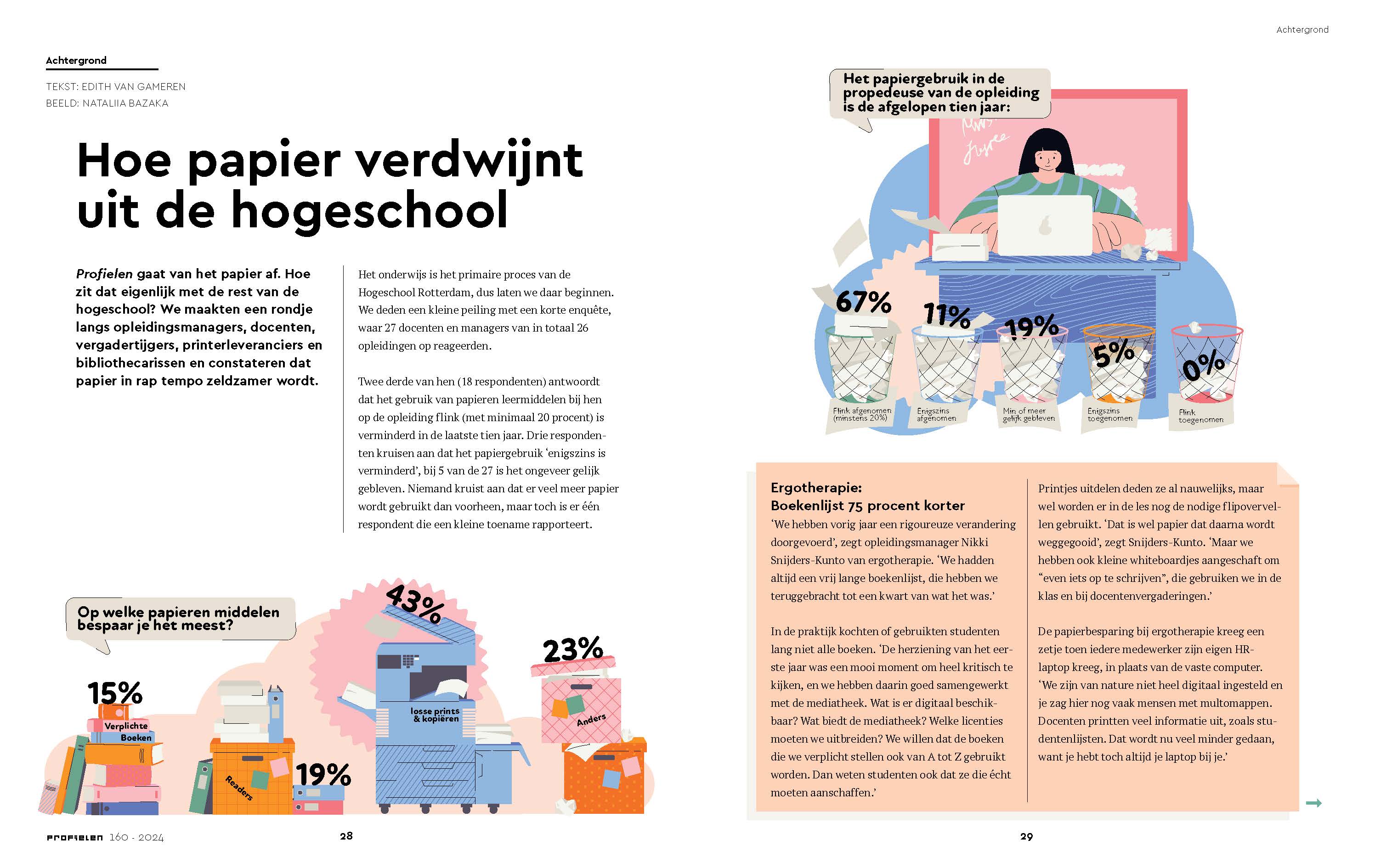
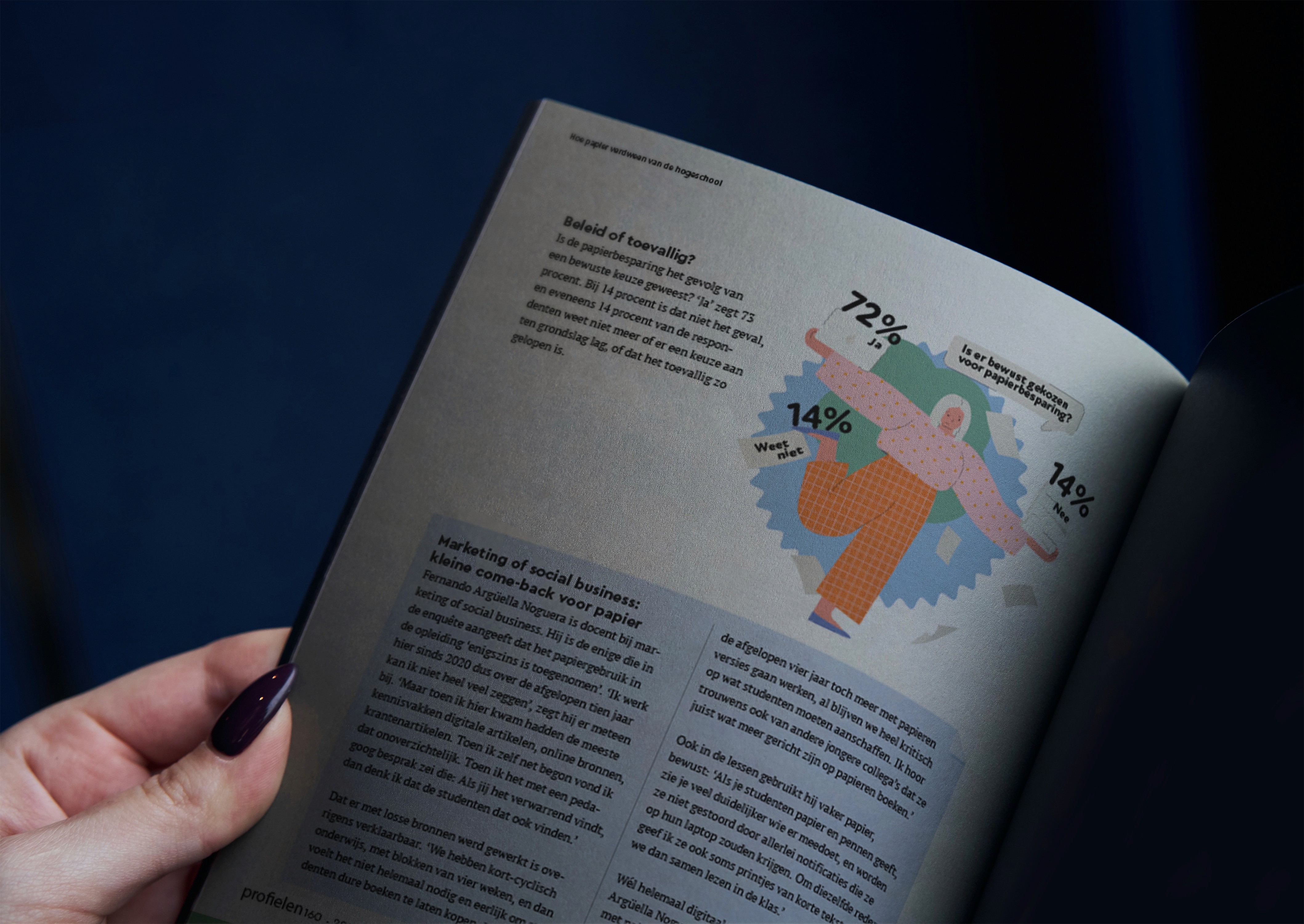
For the last printed issue of Profielen, the magazine of Hogeschool Rotterdam, we were tasked with creating infographics to accompany an article on paper usage research at the university. With full creative freedom, the goal was to make the information digestible and fun for the student audience.
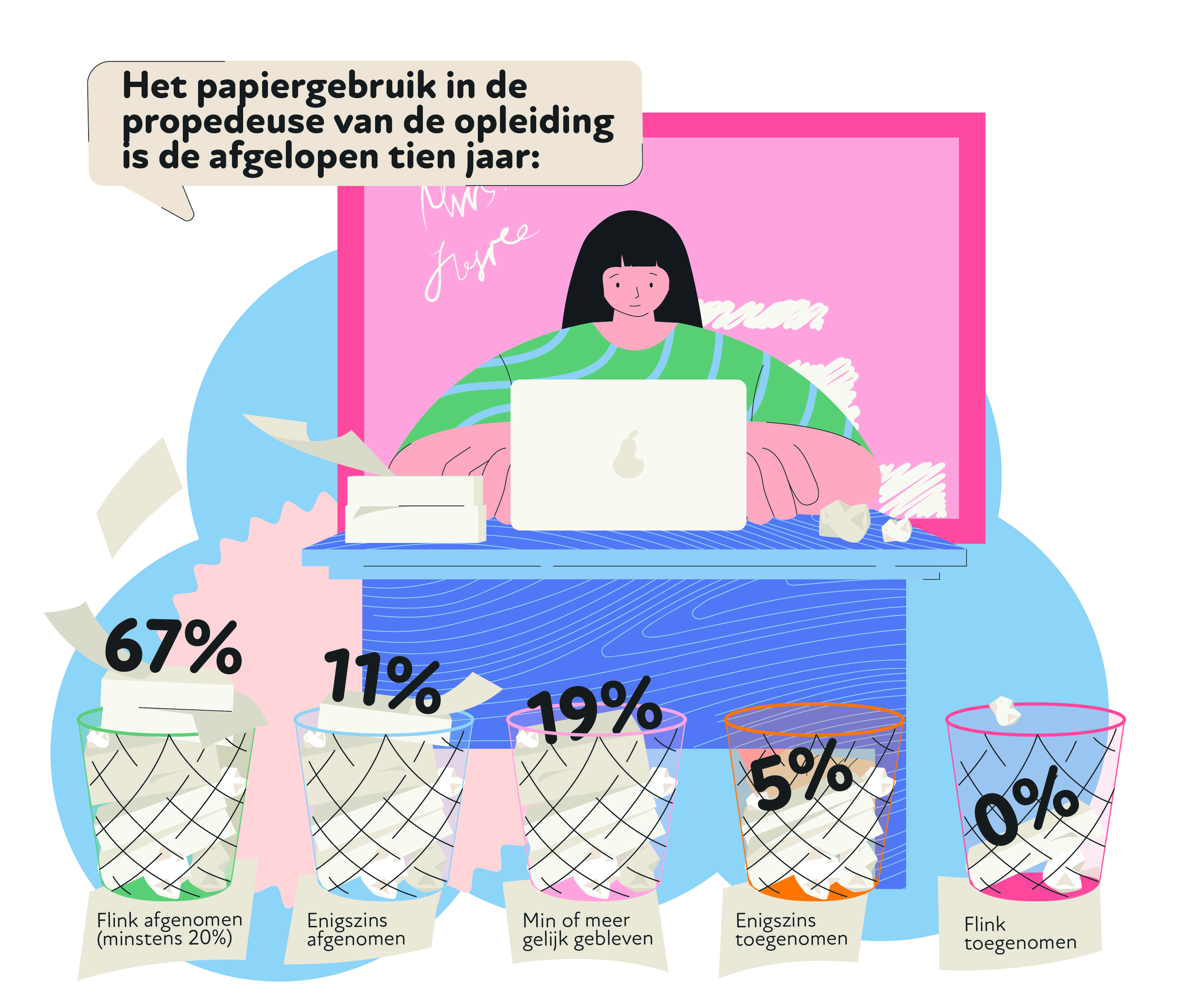
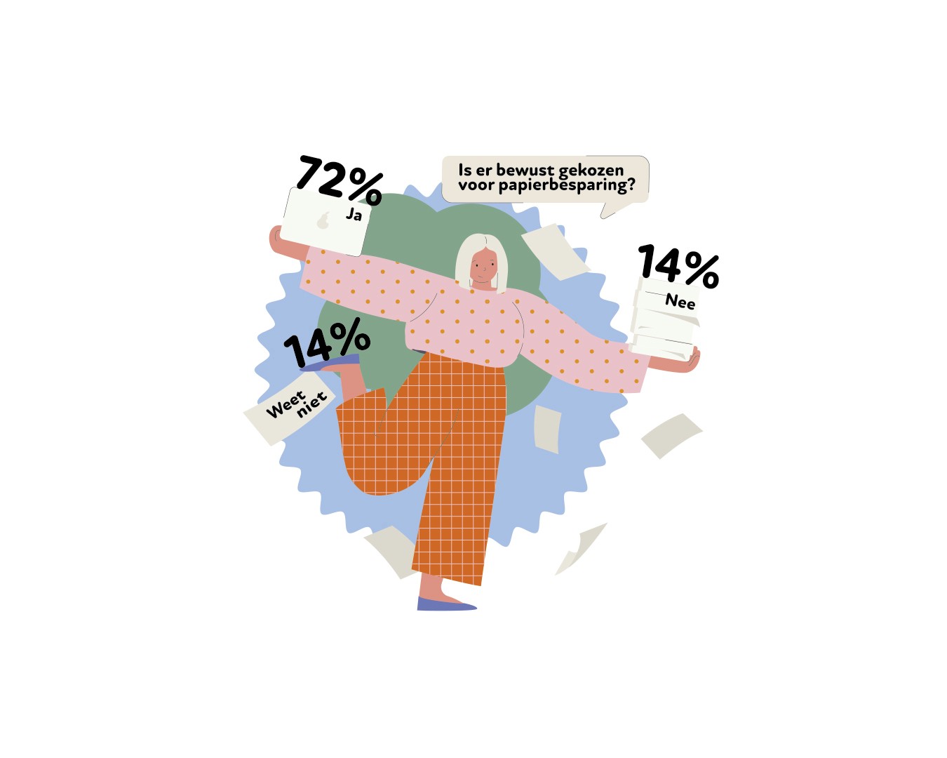
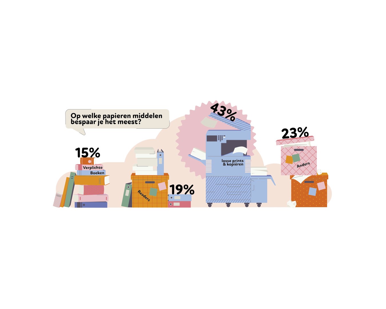
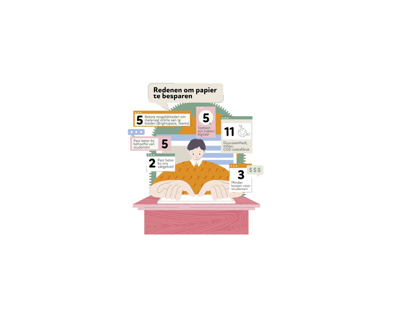
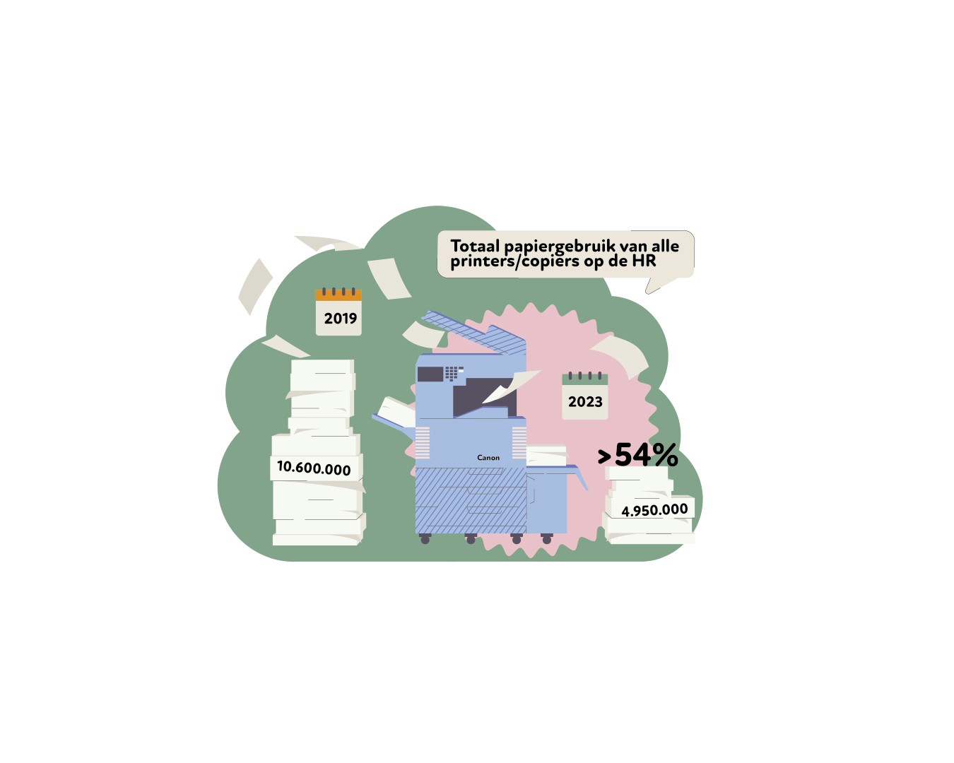
The infographics used a simple background to focus attention on key statistics, while exaggerated body-to-head ratios gave the visuals a playful twist. Balanced, bright, and slightly muted colors made the design engaging without overwhelming the viewer. By simplifying the complex data, the infographics made it easy for students to scan and understand the content.
Despite working under a tight one-week deadline while managing another project, the final result was a set of lively, attention-grabbing infographics that brought clarity and playfulness to the research. Published in the magazine’s 160th and final issue, the infographics made a lasting impression in a highly visible medium.
We are always open for new and exciting opportunities and we are never not on the lookout for talents and bright minds.
[ BRANDS WE DESIGNED FOR ]
SOLVING PROBLEMS
WITH DESIGN
Driven by our love for design, we bring a touch of the extraordinary to every project.
© 2023—2024 NICETODESIGN studio
SOLVING PROBLEMS
WITH DESIGN
Driven by our love for design, we bring a touch of the extraordinary to every project.
© 2023—2024 NICETODESIGN studio
PROFIELEN - Infographics
- Infographics

ABOUT PROJECT
> ILLUSTRATION
[ 2024 ]
Complex research in approachable visuals.
[CREDITS]
Client: Rotterdam University of Applied Sciences
Text: Edith van Gameren
Agency: Niceto Design
Art Director: Niceto Design

For the last printed issue of Profielen, the magazine of Hogeschool Rotterdam, we were tasked with creating infographics to accompany an article on paper usage research at the university. With full creative freedom, the goal was to make the information digestible and fun for the student audience.


The infographics used a simple background to focus attention on key statistics, while exaggerated body-to-head ratios gave the visuals a playful twist. Balanced, bright, and slightly muted colors made the design engaging without overwhelming the viewer. By simplifying the complex data, the infographics made it easy for students to scan and understand the content.
Despite working under a tight one-week deadline while managing another project, the final result was a set of lively, attention-grabbing infographics that brought clarity and playfulness to the research. Published in the magazine’s 160th and final issue, the infographics made a lasting impression in a highly visible medium.
We are always open for new and exciting opportunities and we are never not on the lookout for talents and bright minds.
[ BRANDS WE DESIGNED FOR ]
SOLVING PROBLEMS
WITH DESIGN
Driven by our love for design, we bring a touch of the extraordinary to every project.
© 2023—2024 NICETODESIGN studio
PROFIELEN - Infographics
- Infographics

ABOUT PROJECT
> ILLUSTRATION
[ 2024 ]
Complex research in approachable visuals.
[CREDITS]
Client: Rotterdam University of Applied Sciences
Text: Edith van Gameren
Agency: Niceto Design
Art Director: Niceto Design

For the last printed issue of Profielen, the magazine of Hogeschool Rotterdam, we were tasked with creating infographics to accompany an article on paper usage research at the university. With full creative freedom, the goal was to make the information digestible and fun for the student audience.


The infographics used a simple background to focus attention on key statistics, while exaggerated body-to-head ratios gave the visuals a playful twist. Balanced, bright, and slightly muted colors made the design engaging without overwhelming the viewer. By simplifying the complex data, the infographics made it easy for students to scan and understand the content.
Despite working under a tight one-week deadline while managing another project, the final result was a set of lively, attention-grabbing infographics that brought clarity and playfulness to the research. Published in the magazine’s 160th and final issue, the infographics made a lasting impression in a highly visible medium.
We are always open for new and exciting opportunities and we are never not on the lookout for talents and bright minds.
[ BRANDS WE DESIGNED FOR ]
SOLVING PROBLEMS
WITH DESIGN
Driven by our love for design, we bring a touch of the extraordinary to every project.
© 2023—2024 NICETODESIGN studio
